|
I was asked to create three logo designs with the same concept with different elements. Some of the tools I used to create my logo is the shapes and colors. I used different fonts for each logo name. The lines that are surrounding the logo text had different colors along with the borders. The most challenging part of creating my logo was aligning the 3 shapes and texts so that they all look somewhat similar. I overcame this challenge by grouping each shape and align them. 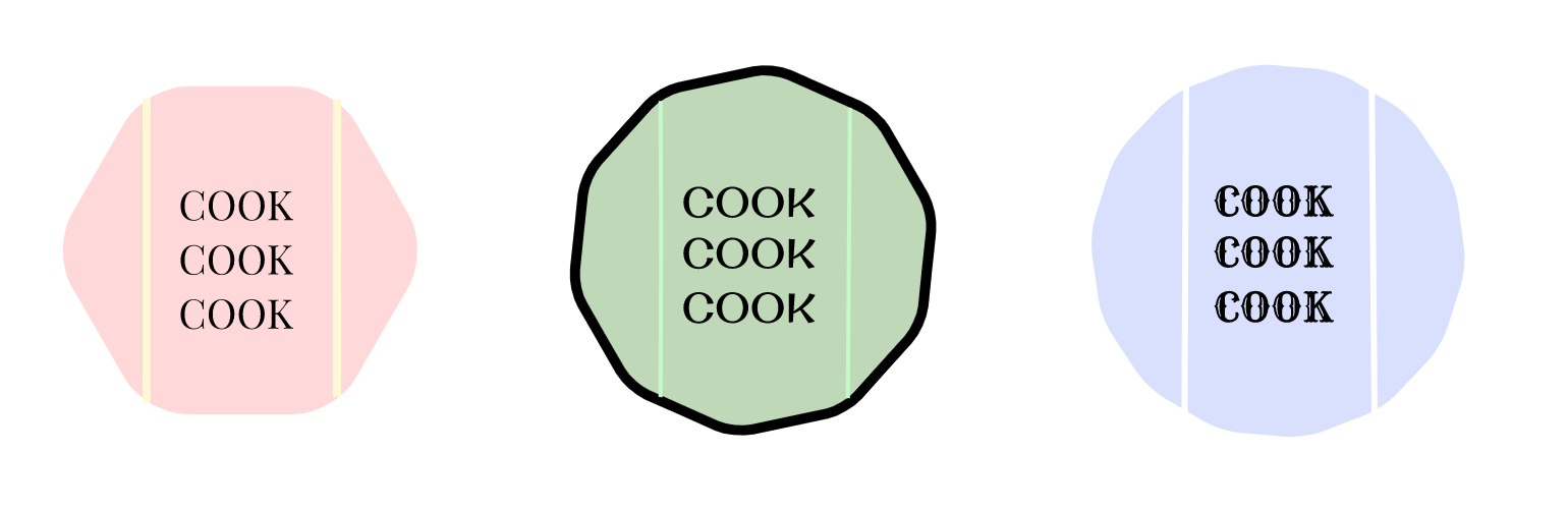 The name of my brand is COOK COOK COOK. I wrote the name COOK COOK COOK because my brand is a cooking class. This represents myself because back in Vancouver I had a lot of fun in my cooking classes. So, keeping that in mind, I decided to make a brand logo that refers back to my memory. My favorite logo is the one on the right. Purple is my favorite color so I think it looks very good. I also like the font that I chose, it's very unique and fun. 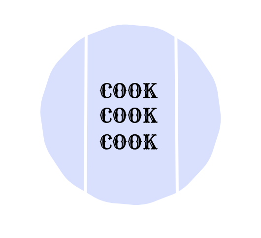
0 Comments
Leave a Reply. |
Archives
November 2020
Categories
All
 This work is licensed under a Creative Commons Attribution-NonCommercial-ShareAlike 4.0 International License. |
